Prev
Monthly Display - March 2024 - page 3 (of 3)
 

Neil Huggett's Gallery | Home Page Menu

List of past monthly displays


Monthly Display - March 2024:


My Unique Expressions of Forms and Spaces - page 3 (of 3)


The combination of the exaggerated aerial perspective, with the contour lines and application of grids over surfaces or spaces, creates new types of images. These images are of real 3-dimensional objects and spaces, but they are not photographic in the colours or line-work used.

I am not aware of any other person producing images that are anything like these. That is why I can state that these images use my unique expressions of forms and spaces.


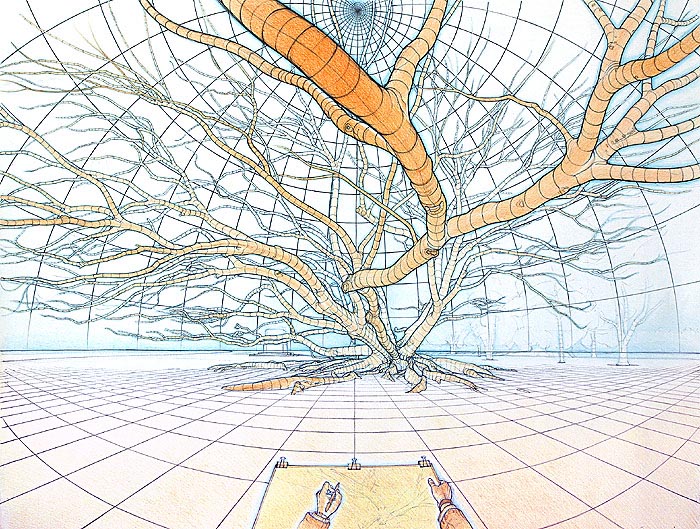
15. Form and Space – The Sugar-Berry Tree


Form and Space – The Sugar-Berry Tree
55 cm (w) x 75 cm (h), conté and pastels on acid-free coloured-ground ‘Canson’ paper.
Date produced: March 2001 - May 2002

This was produced entirely on-site, at the Botanic Gardens in Adelaide over about 40-50 separate half-day sessions. This magnificent tree has so many interesting features that I wanted to try my skills at capturing some of them. The tree is located in a quiet, shady corner of the Botanic Gardens, away from most of the foot traffic that goes through the gardens. This drawing went through considerable development. In the end, my overall plan for the drawing was to use an ‘exaggerated aerial perspective’ to capture most of the forms of the tree and the surrounding space. That is, I wanted to use colour to express (or give an indication of) how close or how distant various surfaces were (the more orange a surface was coloured, the closer it felt, and the the bluer a surface was coloured, the more distant it felt). I also wanted to try to express the space and air around the forms using pale blues to surround appropriate sections of the forms. This approach required working with v ...more details...


16. Twin View of Poetic Tree


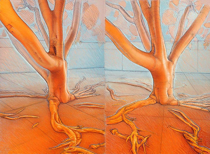
Twin View of Poetic Tree
75 cm (w) x 55 cm (h), conté and pastels on acid-free coloured-ground ‘Canson’ paper.
Date produced: October 2001 - June 2003

Drawn completely on-site on the side of King George Avenue, North Brighton, between October 2001 and June, 2003.

These two views are of the same tree, viewed about 40° apart. I have used these two views, to provide related information about the forms within this tree – I felt that one view alone wouldn’t describe enough of the tree’s forms, whether within the main trunk, the main branches or within the visible roots.

The horizon has been drawn in (about two-thirds the way up the fence at the back of the tree) and is an important reference for the drawing. I have drawn pale imaginary lines over all parts of the tree to give a better idea of the cross-sectional shapes within all forms, and provide visual clues about the orientation of these forms. I have also drawn in an imaginary grid over the ground, to give a better idea of the tree’s orientation between both views, and to describe the ground’s general planar form. ...more details...


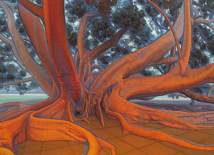
17. Inner Strength - Moreton Bay Fig Tree, Adelaide Parklands


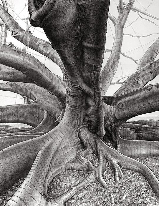
Inner Strength - Moreton Bay Fig Tree, Adelaide Parklands
58 cm (w) x 76 cm (h), charcoal on cream acid-free drawing paper.
Date produced: March - May 2005

I produced this drawing entirely on-site in the Adelaide Park Lands. It was produced as part of an art project called "Microcosm", where I spent two years (2005 and 2006) working on pieces directly from one Moreton Bay Fig tree growing in the Adelaide Park Lands.

The drawing’s view is a very wide-angle view of what I saw. I was sitting very close to the tree, with one leg of my portable easel not far from the ground shown at the bottom of the drawing. Working with such a wide angle view directly from such a huge subject was quite a challenge in itself.

The ideal light for producing this drawing was when it was overcast, but that didn’t happen very often, and when it did, it put the drawing at some risk of damage should it rain suddenly (it did get some fine rain drops on it once). Most of the sessions were carried out in fine sunny conditions, using the different times of the day for drawing different parts of the subject (when they were suitably shaded).

This is the largest, most finished charcoal drawing I have ever produced, and I learnt many things about using the medium. I was keen to include my linear expressions of form, orientation, and flow, (drawing imagined grids over the various forms) over a layer of highly developed tone. I found that a tonal depiction on its own didn’t express the forms strongly or accurately enough. ...more details...


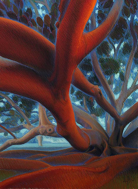
18. Close to the Heart


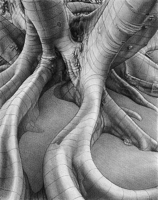
Close to the Heart
58 cm (w) x 74.5 cm (h), natural charcoal on acid-free drawing paper.
Date produced: May 2006

This was drawn entirely on-site. Close to the heart, the main vessels are large, and flow with energy. Being close to the centre of the tree means close to its ‘heart’. Even though a tree may not have an organ called a heart (as animals have), which acts as a circulatory pump, trees also have circulatory systems. Trees need to bring water and nutrients up from the ground out to all of their leaves for generating energy from photosynthesis, for keeping their cells alive. And they need to distribute the results of all the photosynthesis back to all of its cells, including those in its roots. One might consider the important section of trunk just above the roots to be the tree’s heart. All major circulation passes through this region of the tree. Some trees can pump water silently more than 100 metres above the ground to their leaves. How do they do this, especially when a vacuum can only hold a column of water about 10 metres high?

The subject is also close t ...more details...


19. Overview with Foliage as Felt Spheroids


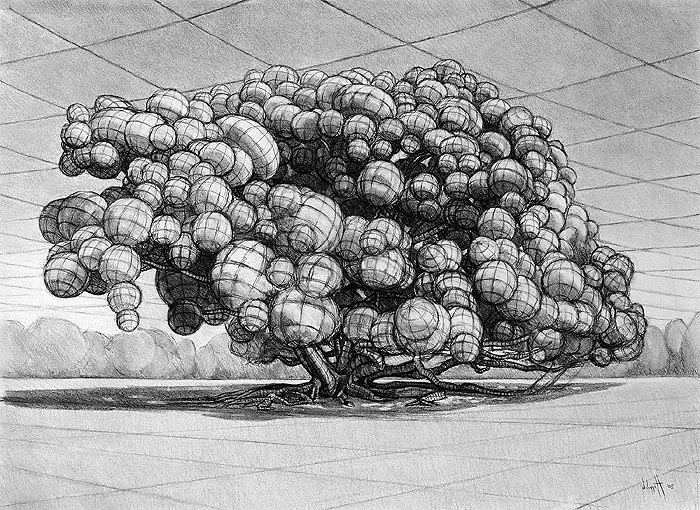
Overview with Foliage as Felt Spheroids
73 cm (w) x 52 cm (h), charcoal on acid-free paper.
Date produced: June 2005

This was drawn entirely on-site. The foliage forms have been simplified and drawn in as spheroids. I am pleased with the sense of the whole canopy titling towards the right (the prevailing path of the sun across the sky), achieved with the repeated orientation of the grids on most spheroids. I think the sense of space between various spheroids works well, as does the impression of weight being balanced by the trunk and main boughs.

To finish this drawing, I added some tone in the sky and changed the grid in the sky used for the expression of its space. ...more details...


20. Under the Spread - A New Version of My Major Drawing from 20 Years Ago


Under the Spread - A New Version of My Major Drawing from 20 Years Ago
73cm x 53cm, black biro and watercolour pencils on acid-free paper.
Date produced: August 2006

This drawing was produced as a way of somehow ‘completing’ the major drawing I had started and worked on for some time during 1984.

This drawing has been done directly from the tree as much as possible as it is now (on-site), but several branches had been cut off since the drawing done 20 years ago, so the original drawing was used as a reference for those branches.

I used biro and coloured pencils, to keep production time down to a minimum (still took several weeks), as opposed to the time required for a production based on pastels and conté (several months for the level of detail required). I kept the drawing to a similar size to the other drawings in this project, which made the drawing size of the tree less than half the size of the original.

Grids were carefully created (set out with the aid of a computer) for the ground plane and sky space to provide expression of the wide-angle space, and to enhance the expression of the boug ...more details...


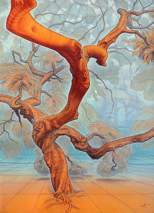
21. The Orange Tree - Form and Space


The Orange Tree - Form and Space
73 cm (w) x 53 cm (h), pastels and charcoal on acid-free paper.

This was produced mainly on-site. With this piece, I tried to produce a strong expression of the tree’s forms, using all of the line work, the tones, and the colours used. Local colours are largely ignored. The colouring used is an exaggerated aerial perspective, where surfaces that are close to me are made more orange (to bring them forward), and surfaces that are more distant are made more blue (to send them back further). I have also tried to indicate the air that surrounds the forms using pale blues around the forms.

I have applied these same principles of colour to the ‘forms’ within the canopy, but kept its tone dark, to help enclose the scene - as it feels in reality.

Contour lines indicate the cross-sectional shapes of the forms, the orientation of surfaces to the viewer, and set up ‘rhythms of flow’ within the depictions of forms. These lines are ‘felt’ from looking at the real forms and are considered by me to be ex ...more details...


22. Forms and Space Expressed Using Colour 1


Forms and Space Expressed Using Colour 1
53 cm (w) x 73 cm (h), pastels on acid-free paper.
Date produced: October 2007

This piece is related to my “Microcosm” project (concentrating two years’ work on one Moreton Bay Fig tree), because it was produced from the same tree used in that project. However, this piece was produced during 2007 and 2008, rather than during the two years of that project (2005-2006).

With this piece, I am attempting to express the forms and space experienced, using mainly colour and tone. Surfaces that are close to me are made more orange, and those that are further away are made more blue. I have tried to indicate the air that surrounds the forms using blues. I found that the overall tone was very important for the expression of the subject.

This piece was produced mainly on-site (directly from the subject - by far, the best way to study the subject), but also partly in my studio from a ‘black and white’ 3-D photograph that I had taken especially for working on this drawing away from the tree.

I tried to work quickl ...more details...


List of past monthly displays

Neil Huggett's Gallery | Home Page Menu

Prev
Monthly Display - March 2024 - page 3 (of 3)